WebApp那些事——(JqueryMobile) 实战(二)
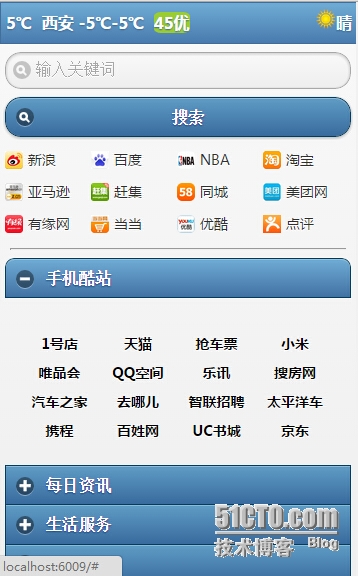
本片还是介绍前台布局,看下图,用过Android手机的用户都知道打开UC浏览器之后会出现下面的网址导航界面。
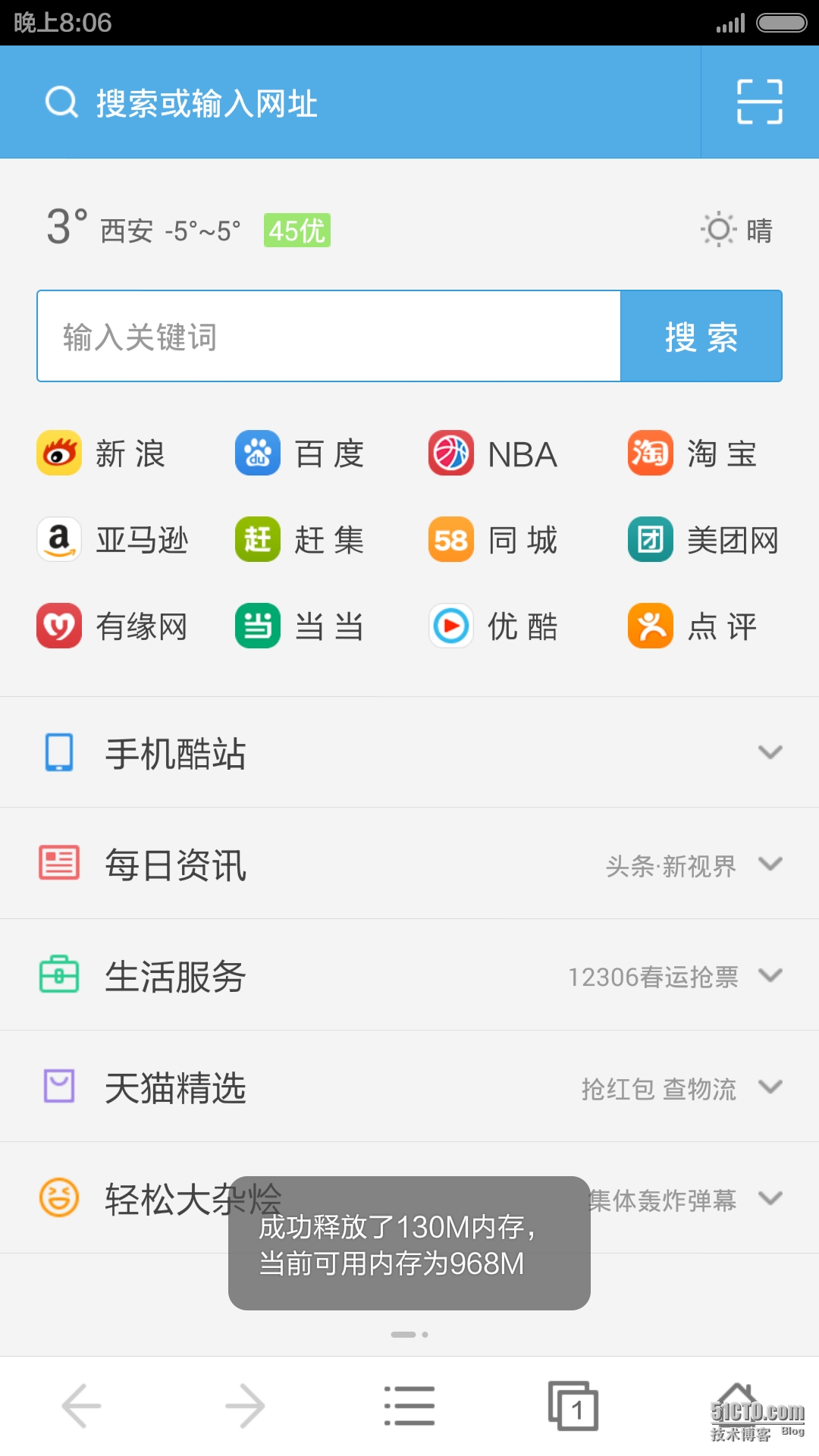
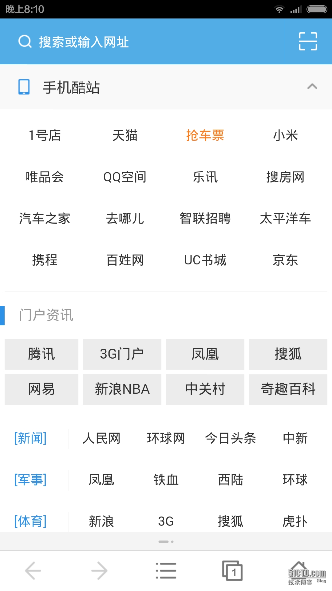
看到了吧,就是这两张,一个是主界面,一个是展开Collapse后的界面。
OK,那么我们先看一下第一张图的布局,首先先看一下head部分,引用了JqueryMobile的css以及JqueryMobile js还有一个angular.js,一个诞生于2009的web前端框架,后被google收购发展壮大。style部分是我自己定义的一些css样式
1
2
3
4
5
6
7
8
9
10
11
12
13
14
15
16
17
18
19
20
21
22
23
24
25
26
27
28
29
30
31
32
33
34
35
36
37
@{
Layout = null;
}
<html ng-app>
<head>
<meta name="viewport" content="width=device-width" />
<meta http-equiv="Content-Type" content="text/html; charset=utf-8" />
<title>Maintitle>
@Styles.Render("~/Content/mobileCss", "~/Content/css")
@Scripts.Render("~/bundles/jquery")
@Scripts.Render("~/bundles/jquerymobile")>
<script src="~/Scripts/angular.js" type="text/javascript">script>
<style type="text/css">
.img-app {
width: 18px;
height: 18px;
vertical-align: middle;
}
.img-app-word {
font-family: 微软雅黑;
font-size: 14px;
vertical-align: middle;
}
.ui-grid-x-margin {
margin-top: 10px;
}
hr {
margin: 15px 5px 0px 5px;
}
style>
head>
OK,Head没什么可说的。接下来我们先看顶部天气部分。
1
2
3
4
5
6
7
8
9
10
<div data-role="header" data-theme="b" data-tap-toggle="false" data-position="fixed">
<div style="height:40px;line-height:40px;margin:0px 5px 0px 5px;font-family:微软雅黑">
5℃
<label style="margin-left:5px">西安 -5℃-5℃label>
<label style="margin-left:5px;background-color:yellowgreen;border-radius:20%">45优label>
<div style="float:right;">
<img src="~/Image/Default/sunny.jpg" height="20" width="20" />晴
div>
div>
div>
天气部分,我们采用了蓝底白字的主题(data-theme="b"),并且是始终显示在页面上的,不会随着滚动条的拉动而消失。OK,这里我们为了使得文字在div中居中,我们设置height和line-height的值都是40px。然后距左右各5px,html中的margin是上右下左的顺序,而silverlight是左下右上的顺序,别搞混了。然后我们还是让晴天向右漂浮,看一下效果

怎么样,还行吧。OK,我们接着往下看,看搜索部分
1
2
3
4
<div>
<input type="search" name="search" id="search" placeholder="输入关键词" />
<a href="#anylink" data-theme="b" data-role="button" data-icon="search">搜索a>
div>
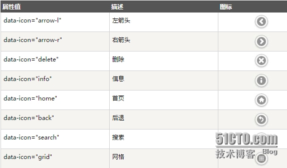
很简单,一个input type="search",并设置未输入前的文字是"输入关键词"。然后search按钮其实是一个超链接设置其data-role="button",再设置icon就行了。icon有如下这么多,你可以随便设置。
ok,搜索做好后,它的效果如下
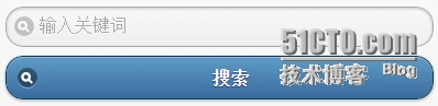
大家看到,放到了两行上,那么为什么会这样,我也不知道,下回再讲。
接下来我们就要看新浪,百度等等12个站点超链接是怎么实现的。大家其实看过上一篇文章的话应该知道jQuery Mobile的网格系统。是的,在这里我要将屏幕分成4份。
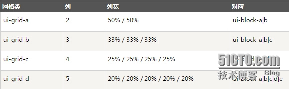
那么我们会使用ui-grid-c这个css将div分成四份。
1
2
3
4
5
6
7
8
9
10
11
12
13
14
15
16
17
18
19
20
21
22
23
24
25
26
27
28
29
30
31
32
33
34
35
36
<div class="ui-grid-c ui-grid-x-margin">
<div class="ui-block-a">
<img src="~/Image/Default/sina.jpg" class="img-app" />
<label class="img-app-word">新浪label>
div>
<div class="ui-block-b">
<img src="~/Image/Default/baidu.jpg" class="img-app" />
<label class="img-app-word">百度label>
div>
<div class="ui-block-c">
<img src="~/Image/Default/nba.jpg" class="img-app" style="border-radius:30%" />
<label class="img-app-word">NBAlabel>
div>
<div class="ui-block-d">
<img src="~/Image/Default/taobao.jpg" class="img-app" />
<label class="img-app-word">淘宝label>
div>
div>
<div class="ui-grid-c ui-grid-x-margin">
<div class="ui-block-a">
<img src="~/Image/Default/amazon.jpg" class="img-app" />
<label class="img-app-word">亚马逊label>
div>
<div class="ui-block-b">
<img src="~/Image/Default/ganji.jpg" class="img-app" />
<label class="img-app-word">赶集label>
div>
<div class="ui-block-c">
<img src="~/Image/Default/58.jpg" class="img-app" style="border-radius:30%" />
<label class="img-app-word">同城label>
div>
<div class="ui-block-d">
<img src="~/Image/Default/meituan.jpg" class="img-app" />
<label class="img-app-word">美团网label>
div>
div> ...........
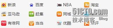
那其实在这里呢,也就是这样实现的,看一下效果。
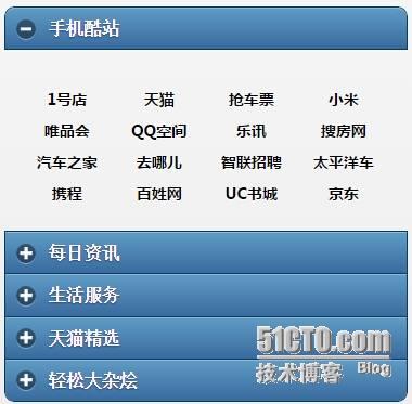
其实这里我是写死的静态页面。OK,我们接着看下面的手机酷站,每日资讯等等可以折叠展开的Collapse panel的实现。
1
2
3
4
5
6
7
8
9
10
11
12
13
14
15
16
17
18
19
20
21
22
23
24
25
26
27
28
29
30
<div data-role="collapsible-set">
<div data-role="collapsible" ng-controller="websiteController">
<h3>手机酷站h3>
<p>
<div class="ui-grid-c" style="text-align:center;">
<div style="margin-top:10px" class="ui-block-{{website.block}}" ng-repeat="website in webistes">
<a href="{{website.link}}" style="color: black; cursor: pointer; text-decoration: none">
<label class="img-app-word">{{website.name}}label>
a>
div>
div>
p>
div>
<div data-role="collapsible">
<h5>每日资讯h5>
<p>Collapsible contentp>
div>
<div data-role="collapsible">
<h3>生活服务h3>
<p>Collapsible contentp>
div>
<div data-role="collapsible">
<h3>天猫精选h3>
<p>Collapsible contentp>
div>
<div data-role="collapsible">
<h3>轻松大杂烩h3>
<p>Collapsible contentp>
div>
div>
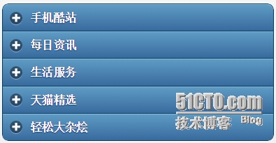
其实在这里我们使用了Jquery Mobile中的collapsible-set,我们可以在这个set中添加我们的collapsible元素。在这里需要注意每个collapsible中只能是 标签,如果改成其他标签则不能被识别。OK,我们看一下效果,不同的主题,不同的感觉。 看起来虽然没有原图好看,但是也凑合能看,其实在这里我也尝试找到一些接口去修改展开图标或者展开头部的样式,但是发现并没有那么好改。所以个人觉得还是没bootstrap做的好。 ok,最后,我们再看看手机酷站展开后的内容,代码如下 1 2 3 4 5 6 7 8 9 10 11 12 在这里我们使用了angular.js这个优秀的js前端框架。大家注意到我们在页面的html标签上标记了ng-app,这样该页面才能被angular.js识别。然后我们在div上又标记了ng-controller="websiteController",这个标记是告诉angular.js当加载该标签时,去调用websiteController这个js控制器。那么这个js控制器在哪呢,在页面底部。 1 2 3 4 5 6 7 8 9 10 11 12 13 14 15 在这里我们定义了网站以及连接,还有前面的block是什么呢,其实是为了布局用的(ui-block-x)。在这里我们在作用域中定义了一个json数组,然后这个json数据在标记ng-controller的div被加载的时候被循环加入到该div中的一个div中。 1 这段代码含义就是循环json对象数组(ng-repeat="website in webistes"),然后根据json数组中的block属性(class="ui-block-{{website.block}}"),来决定加入哪一个网格。其实在AngularJS中,双大括号表示输出,所以我们最后的元素生成后,查看源码如下 大家注意到,其实就是ui-block-a,ui-block-b....,大家可能在这里有个疑问,为什么所有的ui-block-x都在一个ui-grid-c中还能显示正常,不是说分四列吗,这都塞了16列了。大家注意,如果是下一批ui-block-a....,那么它会重新起一行,不会在一行。OK,我们看一下效果 OK,成功了,好了,今天就到这里,我们最后再看一下整体的效果。 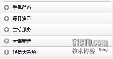
<div data-role="collapsible" ng-controller="websiteController"> <h3>手机酷站h3> <p> <div class="ui-grid-c" style="text-align:center;"> <div style="margin-top:10px" class="ui-block-{{website.block}}" ng-repeat="website in webistes"> <a href="{{website.link}}" style="color: black; cursor: pointer; text-decoration: none"> <label class="img-app-word">{{website.name}}label> a> div> div> p> div>"text/javascript"> function websiteController($scope) { $scope.webistes = [ { block: "a", name: "1号店", link: "http://www.baidu.com" }, { block: "b", name: "天猫", link: "http://www.baidu.com" }, { block: "c", name: "抢车票", link: "http://www.baidu.com" }, { block: "d", name: "小米", link: "http://www.baidu.com" }, { block: "a", name: "唯品会", link: "http://www.baidu.com" }, { block: "b", name: "QQ空间", link: "http://www.baidu.com" }, { block: "c", name: "乐讯", link: "http://www.baidu.com" }, { block: "d", name: "搜房网", link: "http://www.baidu.com" }, { block: "a", name: "汽车之家", link: "http://www.baidu.com" }, { block: "b", name: "去哪儿", link: "http://www.baidu.com" }, { block: "c", name: "智联招聘", link: "http://www.baidu.com" }, { block: "d", name: "太平洋车", link: "http://www.baidu.com" }, { block: "a", name: "携程", link: "http://www.baidu.com" }, { block: "b", name: "百姓网", linhk: "ttp://www.baidu.com" }, { block: "c", name: "UC书城", link: "http://www.baidu.com" }, { block: "d", name: "京东", link: "http://www.baidu.com" } ]; } <div style="margin-top:10px" class="ui-block-{{website.block}}" ng-repeat="website in webistes">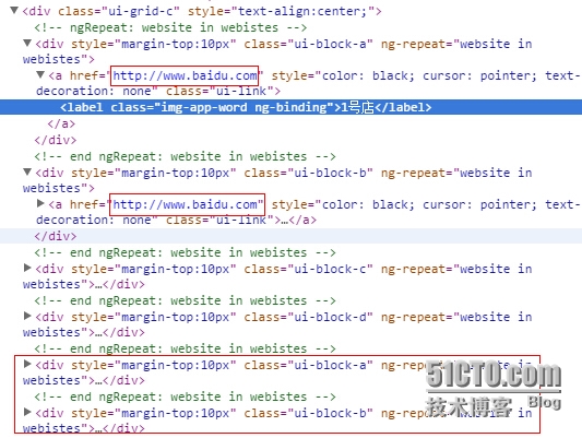
原文转自:乐搏学院http://www.learnbo.com/front/article/cmsIndex
标签:
相关文章
-
无相关信息