matplotlib-曲线图
例1:
"""
plot,曲线图
数据 x 为 0~3 之间随机数 100 个
数据 y 为 exp
"""
# 调用库
import numpy as np
import matplotlib.pyplot as plt
# 0~3之间生成100个数,作为横轴数据
x = np.linspace(0, 3, 100)
# 生成[0,5),5个数
index = np.arange(5)
for i in index:
# 创建图figure 1
plt.figure(1)
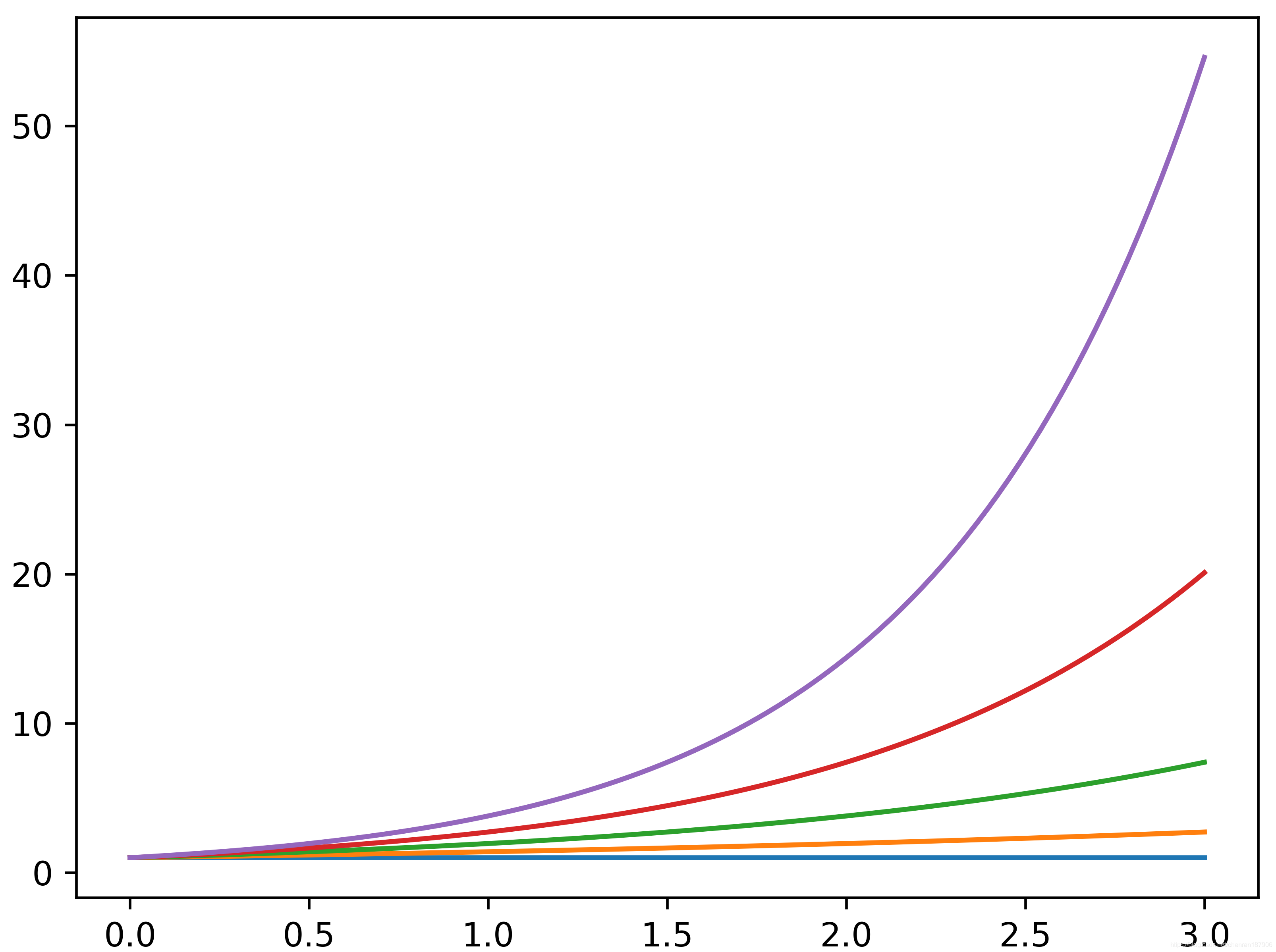
# 数据 1
y1= np.exp(i*x/3 )
# 绘图
plt.plot(x, y1)
# 保存figure 图片,格式为 png 像素为600
plt.savefig(".\figure_png\curve1.png", dpi=600)
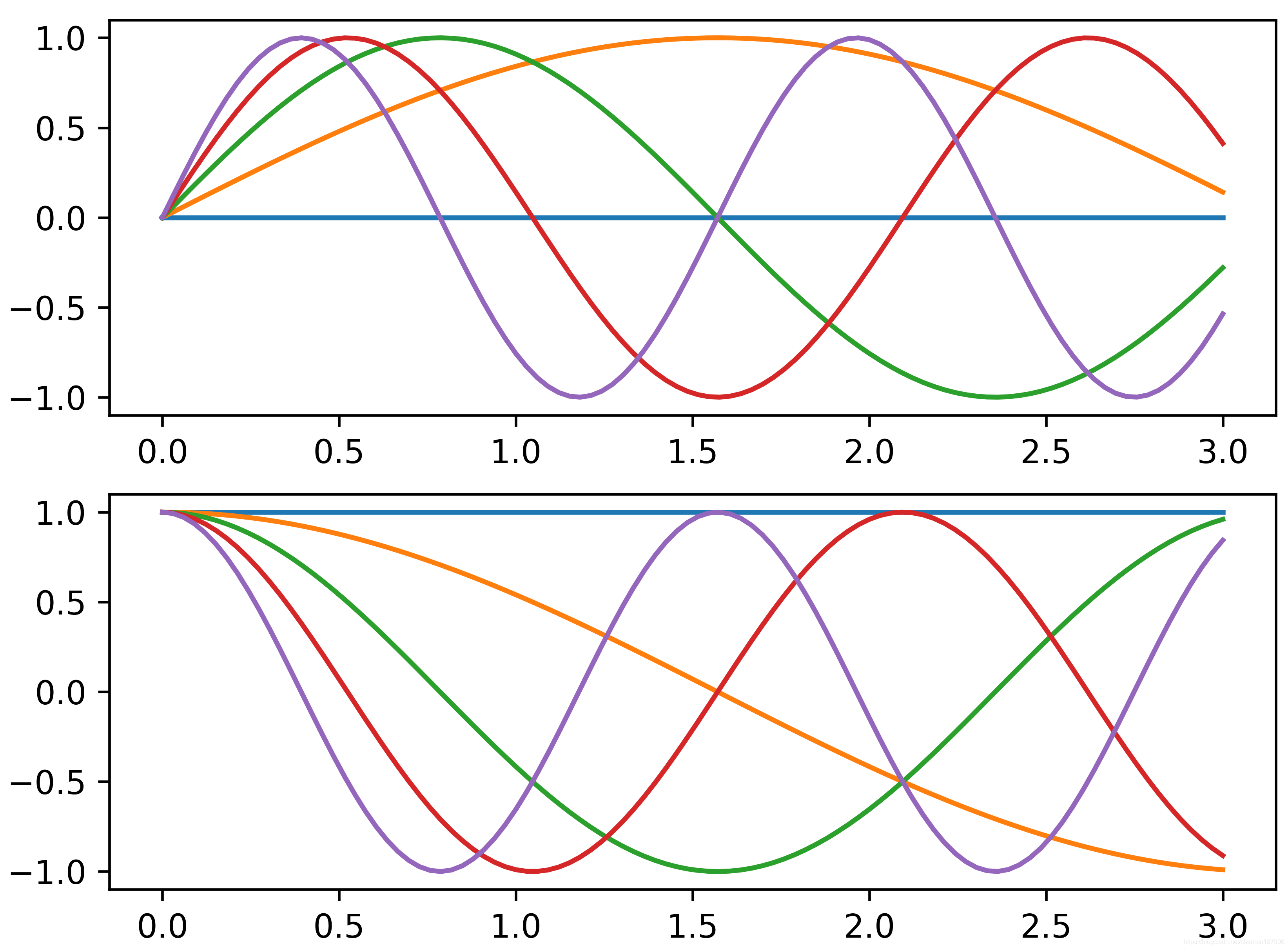
# 创建图figure 2
plt.figure(2)
# 数据 2
y2 = np.sin(i * x)
# 在图figure 2中创建子图 axes 1
ax1 = plt.subplot(211)
plt.plot(x, y2)
# 在图figure 2,子图 axes ,绘图
ax2 = plt.subplot(212)
# 数据 3
y3 = np.cos(i*x)
# 在图figure 2,子图 axes 2,绘图
plt.plot(x, y3)
# 保存figure 图片,格式为 png 像素为600
plt.savefig(".\figure_png\curve2.png" , dpi=600)
# 显示图片
plt.show()
标签:
相关文章
-
无相关信息